This post is the first in a series on the work of professionals who contribute to the success of Prével. I spoke with Sylvie Drouin, head of the design firm Foti Drouin, who has been working with Prével for over 30 years.
What’s her job?
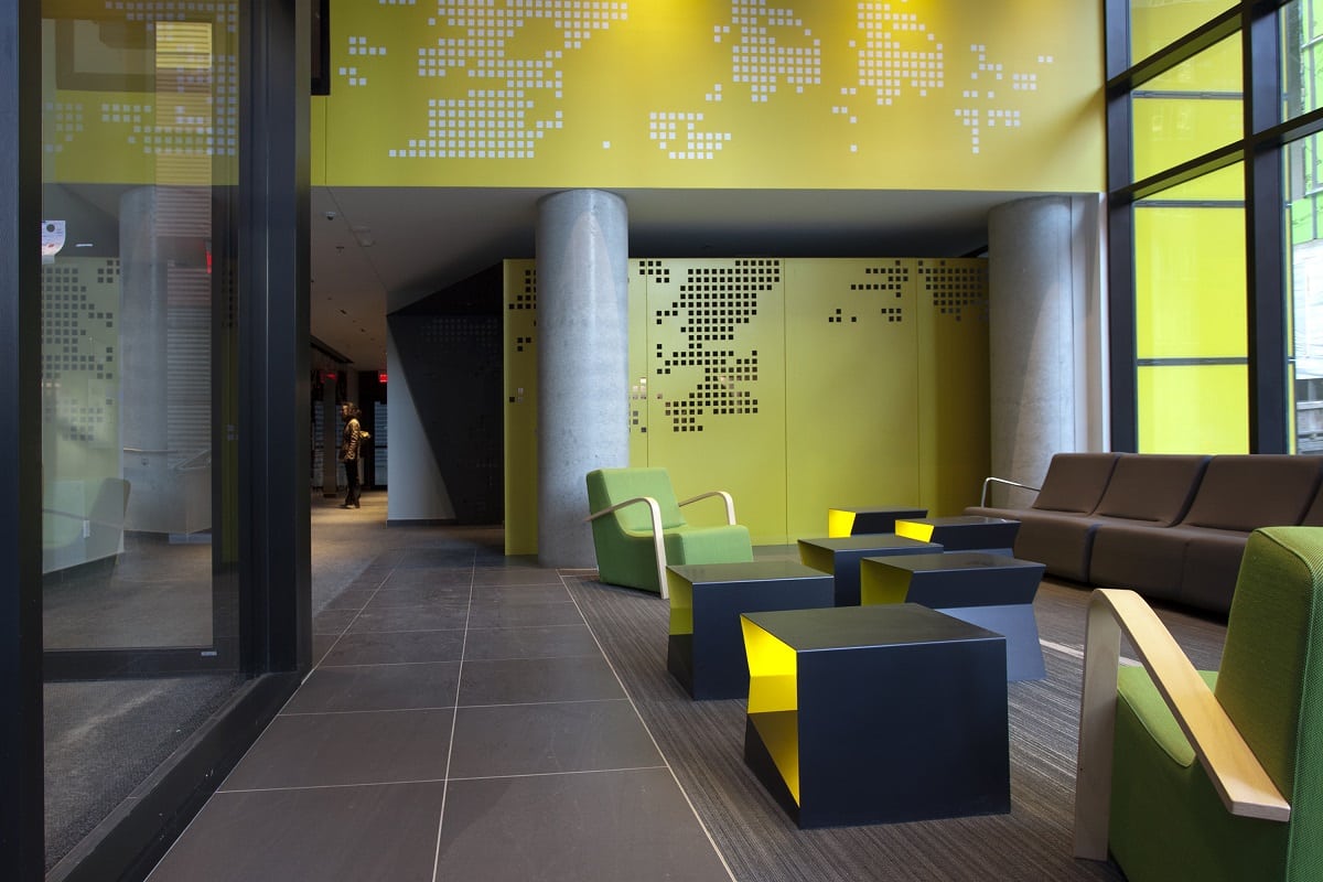
She designs the common areas for Prével, such as the urban chalet, the lobby and hallways. She sees her work as a concrete-styling exercise. Before starting a project she will always use certain references so everything blends together perfectly. Links between the different elements of design are not always visible to those with little experience, but there is nevertheless a general guideline one follows.
For example in the case of Lowney sur Ville, the evening lights of Montréal were the inspiration for the entrance hall. The same style was used for condo front doors, the ceilings and walls in the entrance as well as the mailboxes.
Where she gets her inspiration?
To refresh ideas from one project to another, she likes to go in with a blank slate. She and her team look for inspirational images and work accordingly with the architects. She tries to imagine the people who will live there and then she creates a narrative that helps her develop her idea. When traveling, she is always looking for inspiration.
She likes to compare her thought process to creating a recipe: try different combinations of ingredients to add some piquant. Of course, always keep in mind that the end result has to last for a long time.
Her biggest challenge?
From one project to another, the biggest challenge is constantly surprising clients.
What she likes the most about her job?
She particularly enjoys designing the model units because Prével gives her plenty of latitude to follow her own imagination.
I wanted to know more about her inspiration for the three model units at the new Lowney sur Ville sales office.
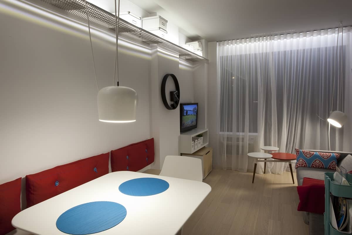
267 square foot unit
Two guidelines were used to design this unit. The first was to offer a certain level of flexibility in a small space. The bench surrounding the table is the perfect example because the space permits several guests while the bench can also be used for storage. The second idea was to give it a pop retro look. The turquoise ceramic and round tiles in the bathroom were chosen with this in mind, just as the perforated metal shelves and round lamps were as well. According to the designer, in a unit of this size, to maintain a sense of space it is important not to add too many accessories.
423 square foot unit
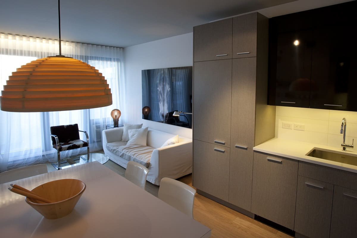
This unit has been furnished with the underlying theme of nature, matter in its simplest state. The bedding with its caribou motif is an example, as is the choice of the flooring color. The animal skin chair and the horse photo further represent this theme.
634 square foot unit
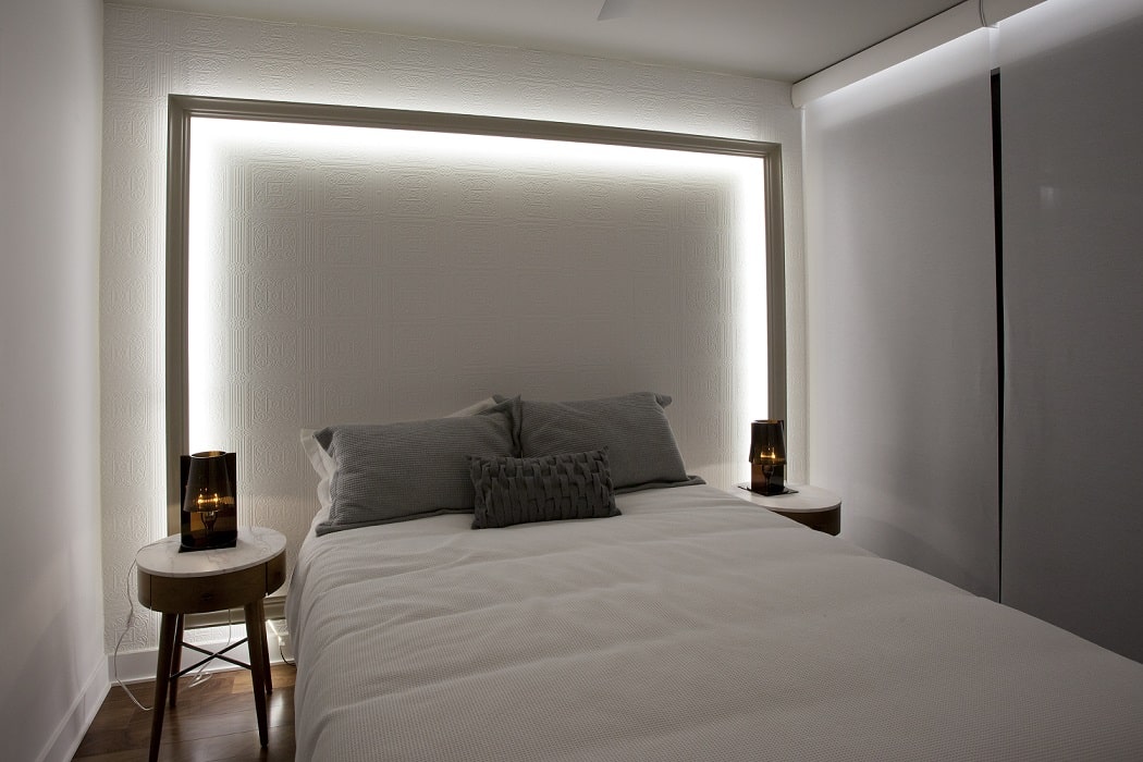
The look of this unit is chic and stylish. The choice of walnut flooring and the ceramic tiles in the bathroom evoke the style, just like the old patterned wallpaper and the frame in the master bedroom.
The designer stresses the importance of including works by local artists, as is the case for the mural in this unit, titled “Quel bon vent vous amène?”, created by Helene Latulippe.

